
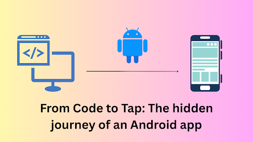
Structural patterns are used to simplify the design by identifying a simple way to realize relationships between entities.These patterns focus on how classes and objects are composed to form a larger structure. Let’s talk about a few design patterns.
Adapter Pattern
The adapter pattern comes from the word adapt. It is like a wrapper interface between two interfaces to make them compatible with one another. An example scenario in Flutter might involve the SliverToBoxAdapter.
Target Interface: Sliver
Adaptee Interface: Standard Widget
Adapter: SliverToBoxAdapter
We will understand this within a few minutes.
When to use:
- Reconciling Interface Differences: When you have two widgets with incompatible interfaces, the Adapter Pattern can bridge the gap, allowing them to work together seamlessly. For instance, you might need to integrate a third-party widget that doesn’t directly conform to Flutter’s layout system.
- Integrating Diverse Widgets Without Modification: The Adapter Pattern enables you to reuse existing widgets in new contexts without altering their core functionality.
- This is especially helpful when you have a library of custom widgets that you want to incorporate into different parts of your app.
Let’s See It in Action:
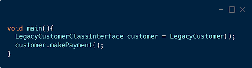
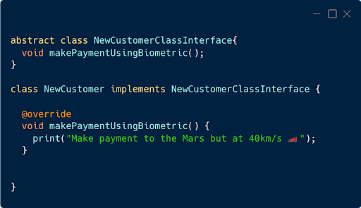
Let’s imagine a scenario where you’re modernizing a legacy e-commerce application. In the past, customers could make payments using a PIN. The legacy code would likely have a function like this:
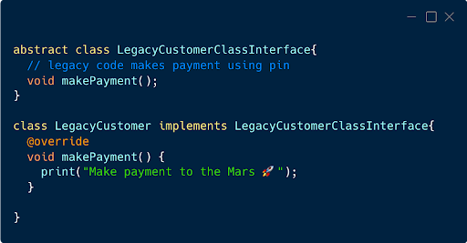
The core logic is as follows:
However, our current requirement is to facilitate payments using Face ID, while preserving the integrity of the existing codebase. We aim to integrate this new functionality without disrupting the established payment workflow. The updated codebase now looks like this:
However, when we attempt to integrate this into our existing workflow, we encounter an error.
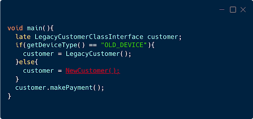
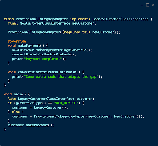
We encounter a compilation error, which is expected as the new NewCustomer class doesn’t conform to the legacy Customer interface. To address this, we introduce an adapter class:
Please note that: While the adapter pattern gives us lots of flexibility, using it for simple ui changes may create unnecessary complex widget trees, potentially impacting performance due to the additional layer.
Proxy Pattern:
As the name suggests it provides a surrogate or placeholder for another object to control access to it. In our current example we will add this as a security layer of our Flutter application.
Let’s See It in Action:
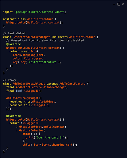
I will not go much into explaining the code. This can be confused with the decorator pattern. While the decorator pattern adds functionality to the existing widget.
Decorator Pattern
The decorator pattern dynamically adds new features without altering the object’s structure.
When to use:
Adding common decorations: You can create decorators to add common decorations like padding, margins, borders, and shadows to widgets without modifying their core implementations.
Implementing custom effects: You can create decorators to add custom effects like animations, transitions, or custom painting to widgets.
Reusable Decorator: You can create reusable decorators that can be applied to multiple widgets, promoting code reusability and maintainability.
Let’s See It in Action:
Imagine a scenario where we have a text widget in a Flutter application. We want to introduce a left-to-right animation effect without altering the widget’s underlying structure. To achieve this, we’ll create a decorator class that encapsulates the animation logic and applies it to the original widget.
Here’s a code example demonstrating this concept:
					import 'package:flutter/material.dart';


class LeftToRightAnimatedDecorator extends StatefulWidget {
 final Widget child;


 const LeftToRightAnimationDecorator({super.key, required this.child});


 @override
 _LeftToRightAnimationDecoratorState createState() => _LeftToRightAnimationDecoratorState();
}


class _LeftToRightAnimationDecoratorState extends State<LeftToRightAnimatedDecorator>
   with TickerProviderStateMixin {
 late final AnimationController _controller = AnimationController(
   duration: const Duration(milliseconds: 500),
   vsync: this,
 );


 late final Animation<Offset> _offsetAnimation = Tween<Offset>(
   begin: const Offset(-1.0, 0.0),
   end: Offset.zero,
 ).animate(CurvedAnimation(
   parent: _controller,
   curve: Curves.easeInOut,
 ));


 late final Animation<double> _opacityAnimation = Tween<double>(
   begin: 0.0,
   end: 1.0,
 ).animate(CurvedAnimation(
   parent: _controller,
   curve: Curves.easeInOut,
 ));


 @override
 void initState() {
   super.initState();
 }


 @override
 void dispose() {
   _controller.dispose();
   super.dispose();
 }


 @override
 Widget build(BuildContext context) {
   Future.delayed(Duration(milliseconds: 600)).then((_) => _controller.forward());


   return AnimatedBuilder(
     animation: _controller,
     builder: (context, child) {
       return Stack(
         children: [
           // First twin
           AnimatedPositioned(
             duration: _controller.duration!,
             curve: Curves.easeInOut,
             left:
                 _offsetAnimation.value.dx * MediaQuery.of(context).size.width,
             child: Opacity(
               opacity: _opacityAnimation.value,
               child: child!,
             ),
           )
         ],
       );
     },
     child: widget.child,
   );
 }
}
To achieve this, we have created a decorator class, LeftToRightAnimatedDecorator, that encapsulates the animation logic and applies it to the TextWidget dynamically.
					runApp(
 MaterialApp(
   home: Scaffold(
     body: SafeArea(
       child: Center(
         child: SizedBox(
             child: LeftToRightAnimatedDecorator(child: Text("Test")))
       ),
     ),
   ),
 ),
);
The code example effectively illustrates the decorator pattern’s core concept of dynamically adding functionality to an object without altering its base class.
You’re right to highlight the potential drawback of a complex class hierarchy when using multiple decorators. This can lead to increased code complexity and maintenance overhead.
Keep in mind that the decorator should add functionality dynamically without altering the concrete class itself and nothing more.